5 simple ways to improve your brand’s image YOURSELF
Building a consistent brand, both visually and communicatively is essential nowadays to attracting more customers and staying relevant.
Oftentimes I find myself consulting with established business owners and marketing teams, discussing basic things that should have been addressed within the first month of trade.
Hiring a third party marketing manager / designer or taking on a staff member is often a big step for developing businesses; and can oftentimes be a costly exercise. I’ve pulled together some easy-to-do basics that will help before AND after developing your company’s image.
1 Utilise your logo and brand components
Branding is all about making associations. Marketing yourself successfully means that your customer draws a parallel between your business and whatever it is your brand says about you (innovative ideas, good value, professionalism, approachability, etc.). By communicating these aspects visually to your client, you not only reinforce your presence as a business, but also the feelings associated with it.
This is done very successfully by big brands. Take for example McDonalds. Walking past a bus-stop ad, you associate the iconic red and yellow colours with McDonalds even before you see the arches or the photo of a juicy quarter pounder. This is because they have build and carefully crafted a visual language, a set of graphics, colours and icons that are used consistently.
Granted, the golden arches do have the advantage of over 70 years of advertising and ridiculous budgets. But the same associations can be made at a much smaller scale with a fraction of the time and cost.
Building a simple visual language is very easy. Start with your logo, if you already have one. Take the main colours (ideally there should be no more than three) and adopt these as your ‘corporate colour scheme’. The more thought into this initially, the better these colours should work with each other. This is why I always advocate designers building brand style guides as opposed to simple logos. In the short term you are paying more, but you will save thousands of dollars in redesigns and mucking around trying to fit square pegs into round holes.
As a side note, if you don’t have a logo, you can use Sqaurespace’s logo generator tool (https://logo.squarespace.com/) to come up with some really clean designs yourself!
You can be as thorough as you like, when we design brand packages we include corporate typeface schemes, support imagery, icon sets, social media graphics and a host of other components. But for small scale start ups, your logo and colour scheme with a nice clean font in mind should be a good enough start!
These visual components will become redundant however if they’re not used in the right way.
2 Be consistent
I cannot stress how important this is … all your efforts and budget spent on design and branding will be for naught without it. Consistency is what will get you that instant recognition from customers; however it is also the hardest to achieve. Going back to our McDonald’s reference, the golden arches logo has been in use since the 60’s. That’s over 4 decades of consistent use – through the successful years, and the not so successful years, to get to a point where now even displaying the restaurant name is not necessary.
Company’s which carefully and methodically develop their values and brand FROM THE START have much higher success in their marketing than their competitors. Opponents who will inevitably have to reinvent themselves every few years to stay relevant. Provided you have a strong visual identity (logo, colour scheme, typeface, etc.) which is continually pushed to your market, this will not be a problem. Keep pushing yourself and your image out there to your customers and you will slowly develop that recognition.
Consistency also relates to how your visual identity carries across in different forms. For example, you may have met a potential client at a function the other night and passed him or her a business card. If they Google your business and your website looks COMPLETELY different to the card OR does not immediately draw parallels to that first point of contact, then they may confuse you for a different business. As a result, all that good networking and whisky you paid for at the function will have been a waste. This is an extreme example – but when your branding is consistent, it should be as easy as possible for your customer to identify you.
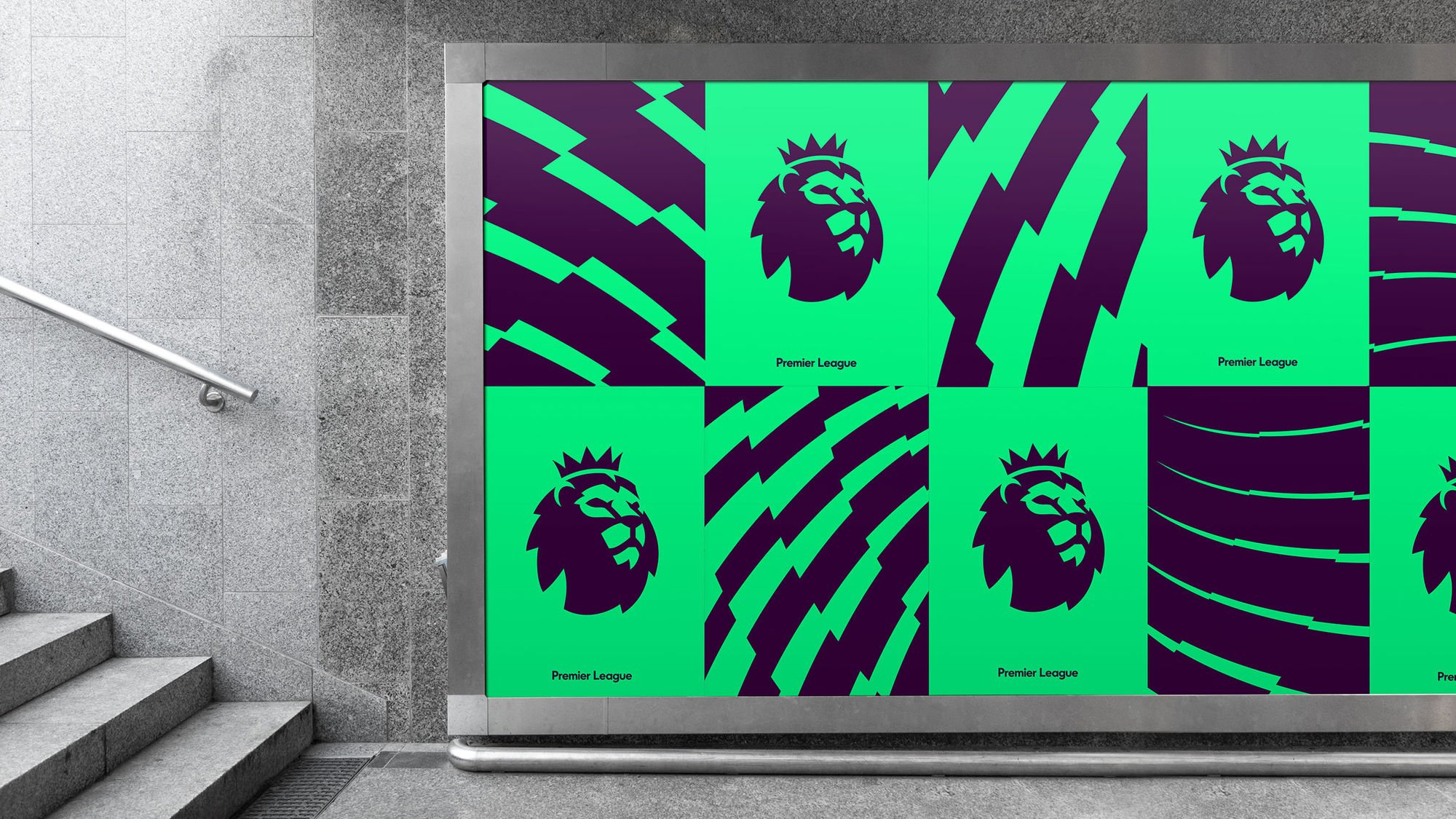

Take a look at the English Premier League’s new corporate identity (which is quite striking, developed by the fabulous DesignStudio). Some logo variations, street advertisements and the score counter shown during the actual matches. The main visual components on display here are the logo, colours, and the jagged shapes working across all images consistently. At a glance it is obvious that all these pieces of marketing tie back to the same company, without necessarily having to have the name always displayed or the logo in your face excessively. Not only does this promote brand recognition in general but the feelings that the brand provokes too, excitement, energy, power, etc.
3 Be Consistent
Let’s talk about using branding consistently at a small business, more realistic level. Larger corporations may have an internal design/marketing team, while medium sized businesses may have a few staff members with the sole responsibility of marketing and social media. Sole traders and small business directors oftentimes find themselves tasked with marketing their entire businesses themselves ON TOP of their bookwork and day-to-day operations. The latter situation is a difficult one to be in, as it can be expensive and extremely time consuming to work AND market by yourself, with the intent of growing.
If someone else manages your branding and marketing (such as the fabulous people at QVC), it may be a good idea to check with them and ensure everything looks visually consistent and that the same message is being communicated across the board. Sit in a room with your laptop and website open, bring in all your stationery + printed docs and place them all on the table. You may find that your letterheads require updating or that the headings on your catalogue are completely different to those on your website. Your email signature may look messy compared to the great job you did with your Instagram feed.
When we as a studio design for small businesses and sole traders, this exercise becomes a lot easier. Everything is done at once, so visual consistency is not a problems; and any changes are easily implemented across all stationery. However there are always things that can be improved. Even small document and letters you mail to a client should always have a logo present or be banded by your company. Things like this can be easily made up as a template in a Word document template, as can a smartly designed email signature. Both serving to reinforce your brand.
It is often a useful exercise to run a mental checklist and see if your brand is visually consistent between all the points of contact you have with your potential clients.
4 Address your points of contact
A ‘point of contact’ is any singular exposure of your brand to your customer/potential customer. Common examples are business cards, vehicle signage, the way you speak, the exterior signage of your building etc. However, a lot businesses neglect many points of contact they have access to. A point of contact can be as simple as a handshake or being polite to someone whilst waiting in line for coffee. The idea is that your attitude can be a part of your brand as well. If your point of difference is being professional and approachable, let this be expressed in your manner AS WELL AS your Swiss-minimal-black-and-white-logo.
Another commonly neglected point of contact is a uniform. A lot of people are adverse to the idea of a uniform, but it can often be an easy way to advertise your business. For example, in the winter we wear jackets with our logo printed on the back and a small list of services (graphic design, social media management, digital printing). The amount of times I’ve been waiting in line at the Post Office and tapped on the shoulder or stopped in the street to chat is surprising. It triggers a spark in other people’s minds – they project how their business could benefit from these services. The same is true for vehicle signage. In this way, it can be said that the most effective kind of marketing is when the client thinks they came up with the idea themselves!
A simple way to assess your individual points of contact is to run a simple dot point list of your average day or week. Work out who you cross paths with and ways in which you can attract more people to you. Particularly with small business, it will be YOU who is doing the selling, so then it stands to reason that the most effective forms of marketing are those which you can directly pass on.
The printed clothing idea above is an industry specific example … but take a self employed tradesman as an example; someone unable to make the time to aggressively market or network their services. Chris the Tree Lopper. If Chris the tree lopper crosses paths with someone and start chatting, he may be asked to quote a job for them. Chris says “no problem, what’s your number?” OR “put my number in your phone”. Now that’s all well and good … but other than what Chris says to the potential client, there isn’t much perceived professionalism or point of difference going on here.
Chris might have some schmick business cards he could hand hand out, and write an appointment time on. What would even be better is having a custom presentation folder, printed and finished nicely, with a business card slotted in, containing documents with some rough pricing and a list of services. A small document that outlines what makes his company special and how tree lopping can improve your garden’s health or YOUR HEALTH. Chris could even carry duplicate quote sheets with him and tear off a copy for the customer right then and there.

All these things provide the client with “perceived value”. Chris has spent INVESTED extra time and money to ensure the client knows he’s not just another guy trying to make a quick buck. He’s also saved the client time and money by quoting them right then and there, rather than the annoyance of back and forth emailing or phone calls.
Once you identify when and how you’re interacting with your potential customers, you need to understand WHO they are.
5 Target YOUR market
There’s no point in trying to sell farming equipment to office workers, or boxing gloves to women in their 70’s.
It is absolutely essential that you are able to identify your target market in your business plan and tailor everything to this market. This extends to your branding too … Brightpod have published an excellent article on How to Design for Your Targeted Demographic HERE.
Once you have identified your target demographic and tailored your content to suit their needs, you need to work out the best way to get the content TO THEM (or their general demographic). If you’re a local pizza restaurant, you would want to print your takeaway menu and direct mail to local homes and addresses. If you are selling high-end computer graphics cards, it may be better to build a partnership with a local computer service centre or encouraging referrals through Facebook groups.